Park Access and Equity
Equitable Access to Parks in Los Angeles County
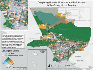
As part of my cartography final project I built a series of static and interactive maps from a customized data calculation to quantify and visualize the relative access to quality greenspace compared to household income in Los Angeles city and county. Data was gathered and managed from publicly available sources such as the Los Angeles County open data portal, US Census, and California State Parks. Then I created a calculation using a custom Python script to calculate a park score which uses distance and park size to assess how much access each census tract has to quality greenspace.
In the final cartographic elements, a bivariate choropleth map was used to help show the comparison of park score and median household income. Areas with a stronger orange color represent higher income census tracts, while a darker blue represent higher park access. Dark green signifies areas with both high park access and income, while whiter areas represent low access to parks and income.
To learn more about this project check out the storymap, which includes an interactive webmap.