Digital Divide
How does access to digital tools vary across race?
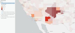
I created this web map with the goal to use ACS data to measure digital exclusion with different ACS fields to match the NDIA definition for digital exclusion such as people without a computer, or without an internet subscription besides dial-up. I specifically focused on digital exclusion in Black or African American populations, which enabled me to apply the same analysis for all racial groups. This began by calculating a field for digital exclusion of Black populations that synthesized multiple ACS data points. I visualized this calculation using a basic symbology of graduated colors and built a histogram to show the different numbers of counties with levels of digital exclusion by race.
One observation is that White populations have much lower rates of digital exclusion compared to other races especially Black and Native American populations. To symbolize digital exclusion relative to the white population I calculated a new field in ArcGIS Pro and visualized it in the map. I excluded smaller population areas with fewer individuals than the margin of error, and ultimately identified 595 counties where Black populations are twice as likely as white populations to be digitally excluded.
To extend this analysis to other groups I created a map visualizing Native American digital exclusion and used my own symbology to emphasize larger concentrations of Native American exclusion by absolute population numbers by setting the transparency based on the total number of Native American households.
I also developed a web app that allows users to interact with a map and pop-ups that show the percentage and likelihood of digital exclusion by race. I edited my map to emphasize communities more clearly with high need and added additional fields to clarify the absolute numbers of different racial groups with and without digital access to the pop-ups.
You can see this final product at this link: